Case studies ⟶ Shelved
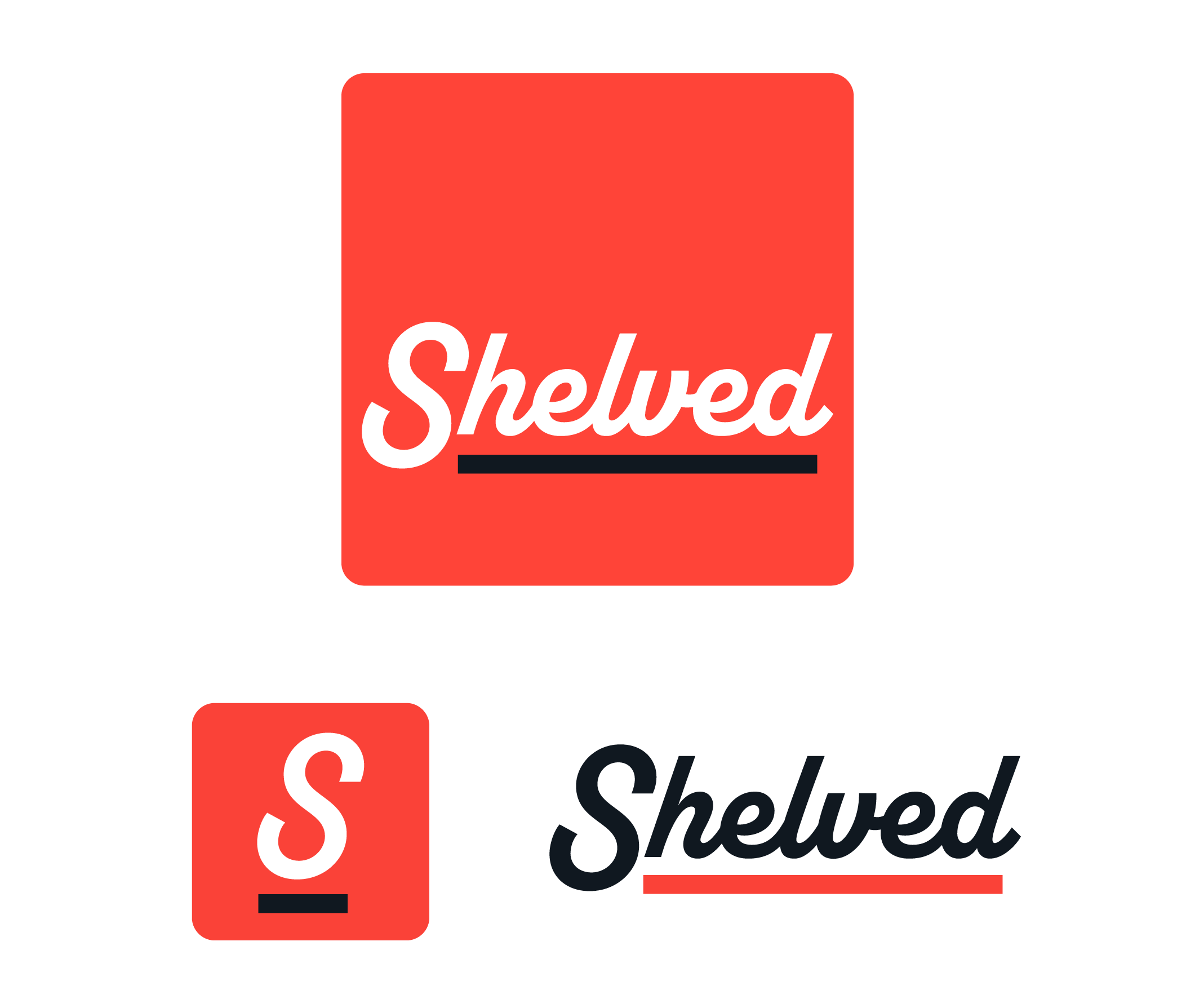
Shelved visual experience
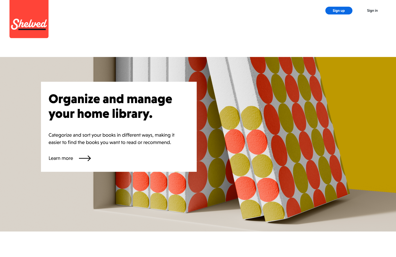
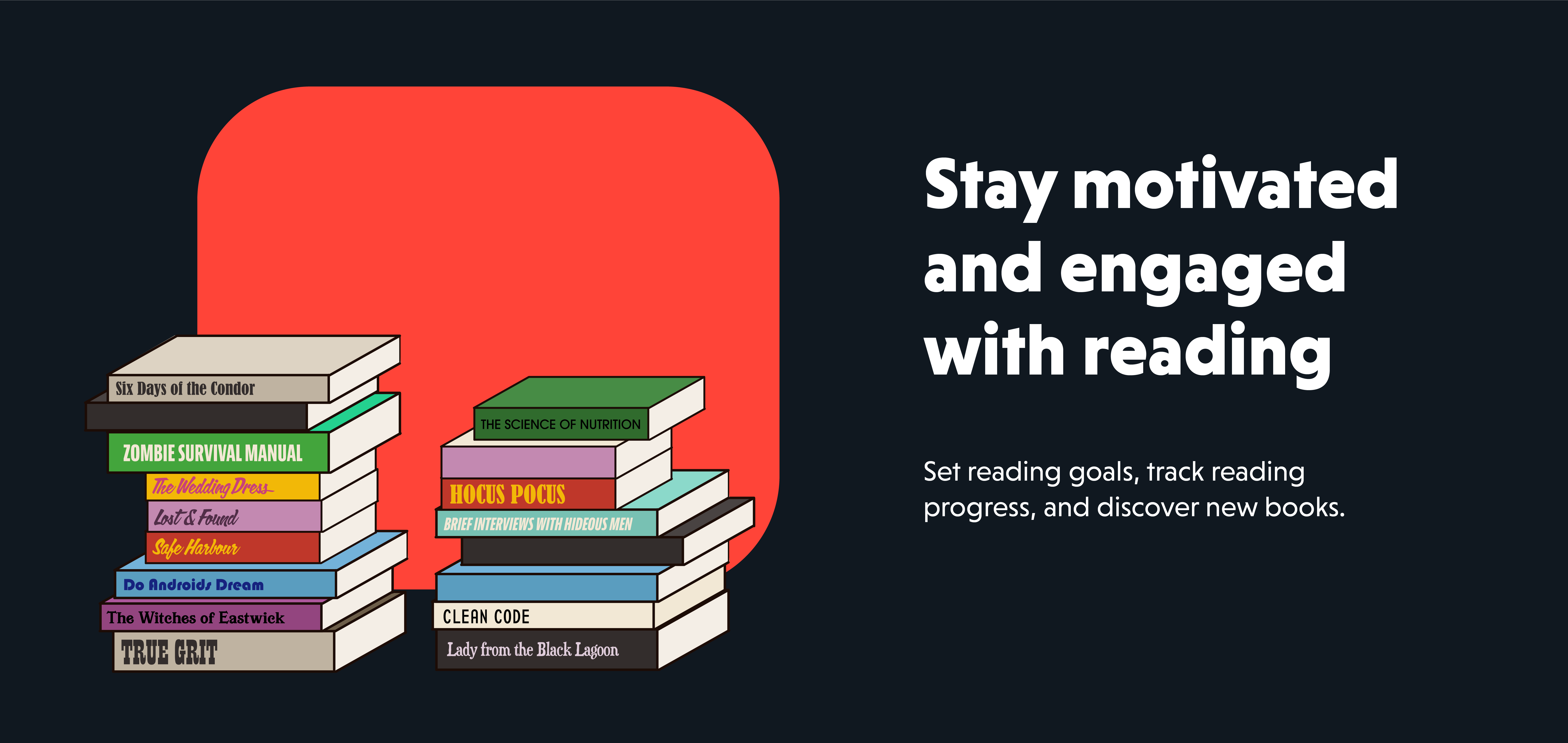
Shelved is an app designed to manage and keep a home library organized. It also allows for tracking borrowed and lent books. It promotes sharing meaningful content, setting reading goals, adding notes and reviews and discovering new books.
Design challenge
Create a consistent online presence and brand identity. Make it easier and more enjoyable for users to manage and maintain their book collection by providing intuitive functionalities and engaging visual setting.
Phase 1: Research
Role
Visual identity
Brand development
UX and UI design
Tools & technology
Adobe Illustrator
Adobe Photoshop
Figma
2023
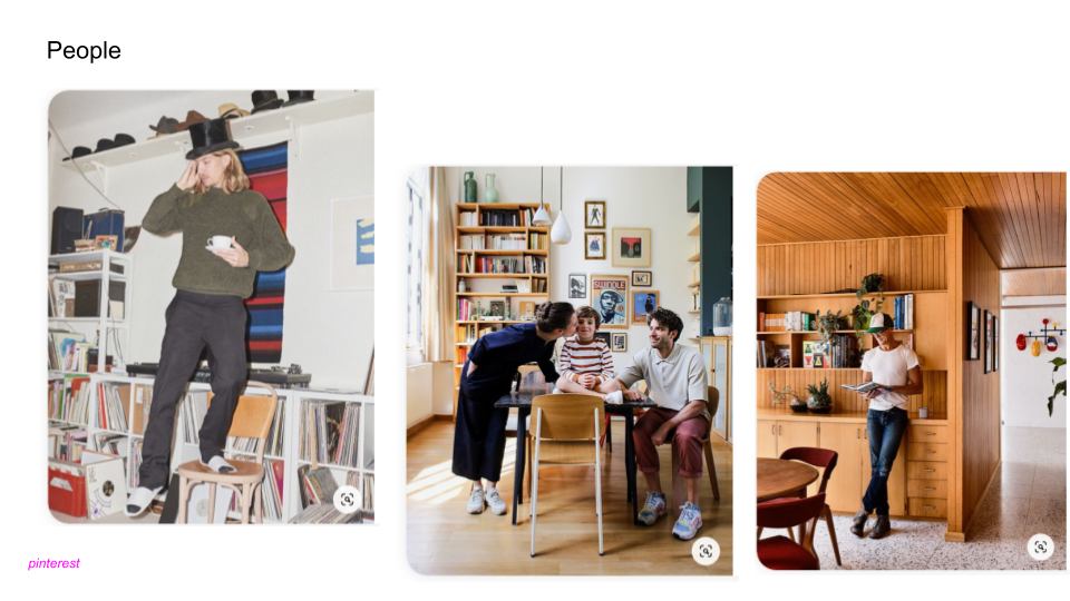
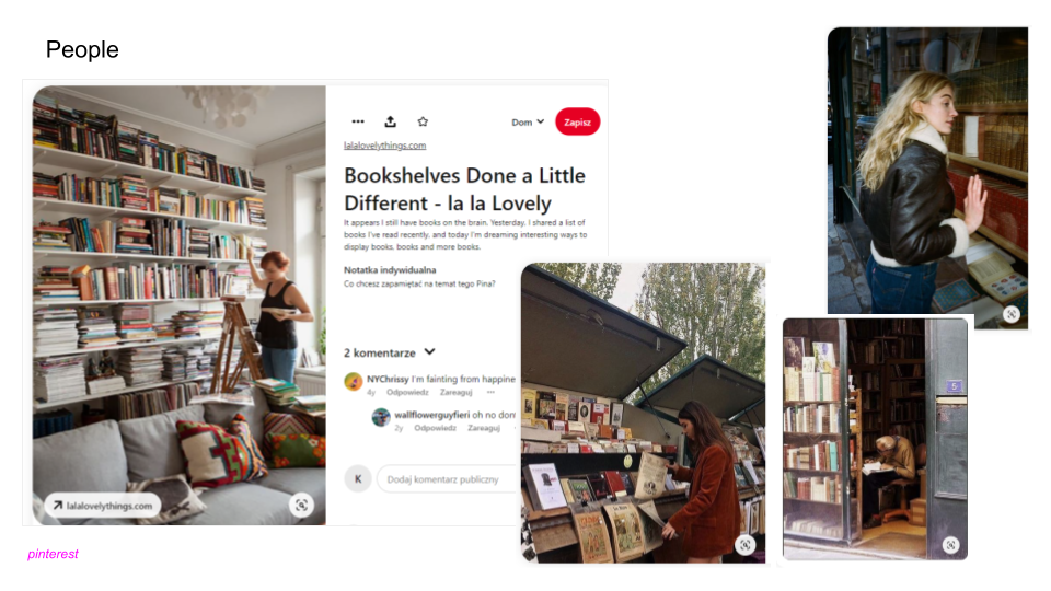
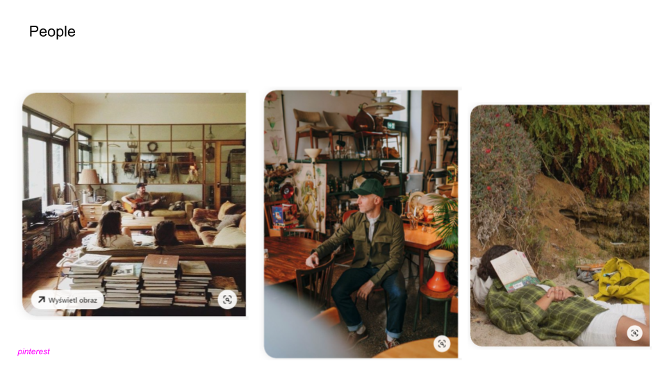
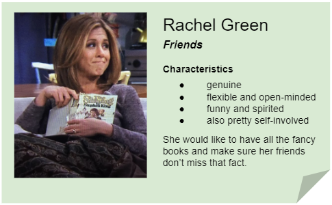
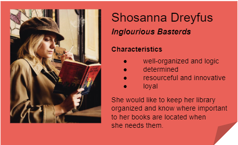
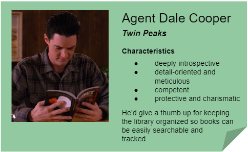
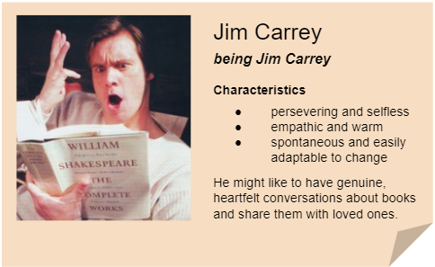
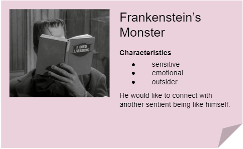
Personas
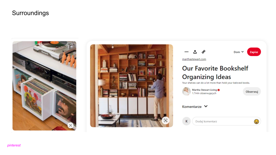
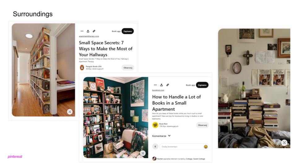
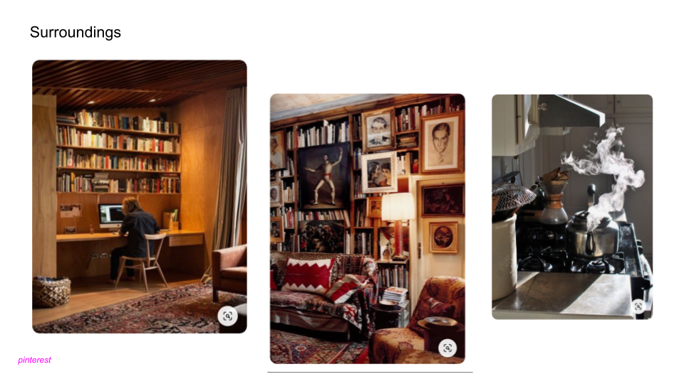
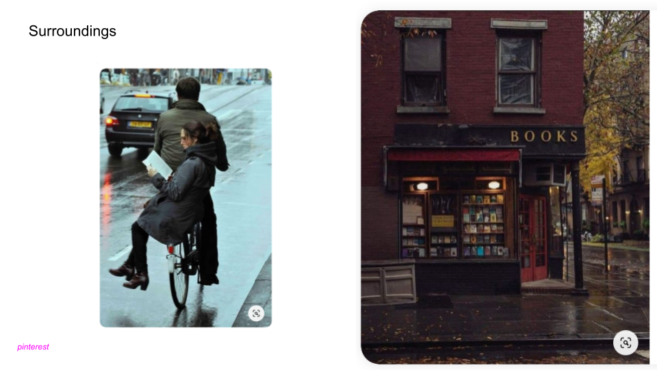
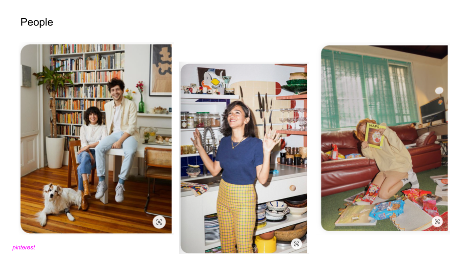
I played a little bit with the concept of personas. I read the characteristics of fictional characters and famous people online and tried to figure out what they would appreciate or focus on when using the app.
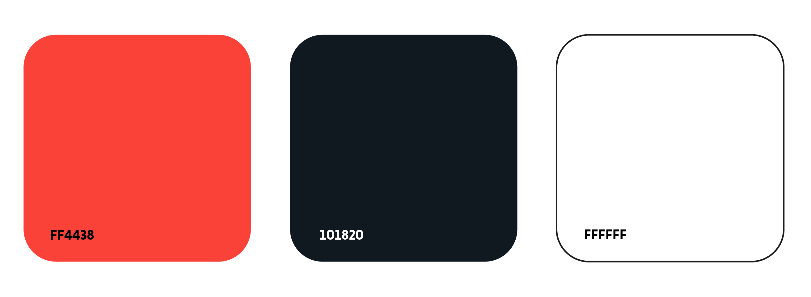
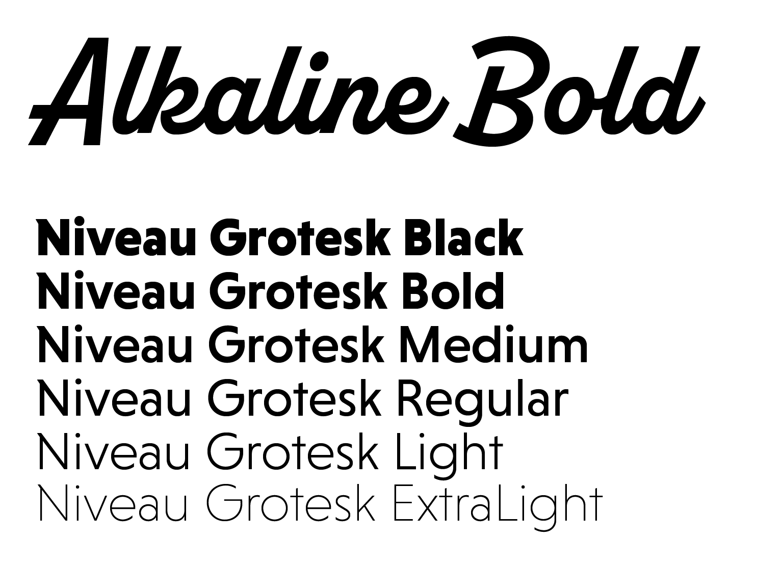
Visual identity
The app's interface and navigation had to be simple and minimalistic. Still, I wondered if there was a way to incorporate some of the features of a maximalist's preferences through typography, colours and imagery that could give the app a little bit more extinguish flair and create memorable visual impact.
Phase 2: Design